images/misc/barrens_alt_logo_trans.png
Patch 1.5
4th February 2019
Race & Class Comparison Tool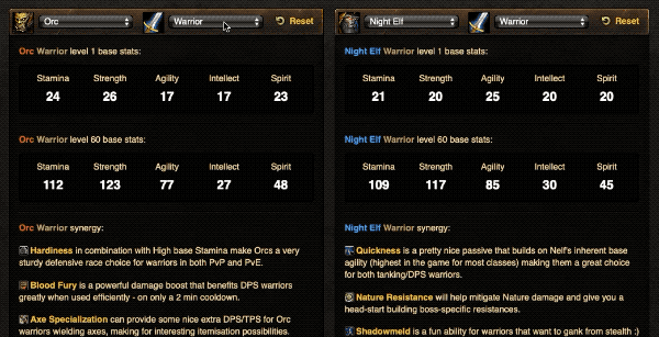 /images/updates/comparisonprev.gif
I read a lot of other forums, sites and discord servers about Classic wow and by far the most common questions asked by people are: 'What race should I choose for X class?' There are so many people who are still very undecided on what they are going to 'roll' when Classic comes out and I thought it would be a neat idea to make a side-by-side comparison tool which can help people make comparisons between two choices easily.
Each choice is a combination of race and class - as if you were on the character selection screen. Once the user has made two 'choices, the tool first displays base stats at level 1 and at level 60 for both choices. These base stats do not calculate extra additions from passive racial traits like Expansive Mind, Endurance etc.
Following this, it displays each choice's racial trait abilities and passives (including extra racials for priests like Fear Ward for Dwarves etc.) with a small paragraph on 'Synergies' of each particular race and class combination selected. A simple example is a Tauren Warrior has a lot of synergy due to high base stamina/strength values combined with Endurance. This lets you compare, using the wowhead tooltips, which racials you would like best.
*For some real detail it can be used alongside with the base stats calculator I built a few months ago to determine exactly what effects these differences in base stats actually entail. When I am home and have sufficient bandwidth I'm also going to add in pictures of tier sets for each race/class combination so people can see what their character might look like. Looks are very important after all!
Homepage Carousel /images/updates/carouselprev.gif
Built a carousel on the index page to highlight the newest guides and tech resources that have been released, and to welcome Guests too. This replaces the welcome banner that existed in v1.4.
The reason for this is the guides and tech sections are fairly hidden away with no other links to them besides the nav bar, and a lot of new visitors don't really explore these areas (unless they hit the pages directly from google etc). It also gives a nice bit of eye-catchiness to the home page where a lot of people land.
 /images/updates/carouselswitch.gif
It is enabled by default for both Guests and Members - you can of course switch it off if you don't want it there - by hitting the little cog next to the prev/next buttons in the subheader and using the toggler. Your choice will be remembered by cookies!
Advanced BBcode menu /images/updates/abbcodes.gif
Anyone who has written a Guide for BC will know that the formatting can be a huge PITA since the BBcodes had to be manually typed in and copy + pasted everywhere. I've tried to make things a bit easier for the future by making an extra row of BBcode buttons that can be shown optionally.
Other smaller changes
 /images/updates/hovertext.gif
Bug fixes
Notes
Not the most feature-rich update I know but some smaller changes and a lot of important bug fixes that I hope you will appreciate! This is because I have been very busy and want to start focusing on content and publicising the website now in the run up to release month which is really not that far away. These are more important priorities for the site at the moment and as you all know I am very wary of feature-bloat as it is.
I was going to implement some more profile customisation stuff but didn't get round to it - is there anything in particular that you guys would like to see on your profiles? If so leave your comments below. As for security stuff - things have stabilised now and I have adjusted the threshold for people being 'banned' based on their IP address which was an issue before.
Bonus - old concept art from beginning of development
I thought you guys might want to see some of the old concept images and sprites I was building when I started thinking about building Barrens Chat. Open the spoiler below to have a look into the past and a bit of insight into how the site has improved since I began work :smile:
This isn't the first community I tried to build. Back when Diablo 3 was announced I thought (foolishly) that it was going to be the next big thing and though I'd try and build a forum and social network around the hype. The game eventually failed but I learned a lot more web design and coding skills from the project. I worked hard on it but when the game came out and crashed so badly (especially with D2 players like myself who hated the new game) that the forums died and I eventually lost interest.
A lot of the design conventions I used back then have found their way into Barrens Chat, as you can see from the screenshots below. The site also had some pretty cool functionality, like a profile/wall/friends system a bit like Facebook, and also an instant chat. People could create a 'Clan' page and have their own private forum, and use it for recruiting etc.
/images/oldconcepts/d1.jpg
/images/oldconcepts/d2.jpg
/images/oldconcepts/d3.jpg
/images/oldconcepts/d4.jpg
/images/oldconcepts/d5.jpg
When WoW Classic was announced I thought I would give it another go. Six years had passed and I hadn't done any website work in a while so I thought it would be a fun project to attempt :smile: The old diablo forums were built in 2012 and a lot of the code and extension work was very outdated (using phpBB 3.0) so I would have to build the template again from scratch.
/images/oldconcepts/1.png
First concept based heavily on the D3F design and using many of the same art assets. Started thinking about the logo and header stuff.
/images/oldconcepts/2.png
Was originally going to have a traditional forum format with lots of sub-categories etc. but eventually decided against it as being superfluous and unnecessary, especially whilst the forum was just starting out. Logo improved a little bit.
/images/oldconcepts/4.png
Was thinking about an alliance/horde adjustable theme before I started coding and eventually implemented it in patch 1.2.
/images/oldconcepts/3.png
The UI for the UCP looked a bit different back then with heavy use of the rectangle buttons and a sort of sidebar on the left.
/images/oldconcepts/5.png
The editor looked a little bit different but I had most of the icons and smilies drawn up by this point.
/images/oldconcepts/7.png
What the master sprite looked like in early development.
I wish I had more pictures so I could make a sort of timelapse gif of one page etc. but I don't. These are the only screenshots I have from back then, along with 1000s of 'scraps' (files that I used to make final art assets and then left lying around in case I would need them again). Hope you enjoyed seeing these :smile:
As usual, any bugs or feedback you might have just reply to this post. Hope you enjoy patch 1.5 :)
Your boy,
Teeb
You never disappoint teebling..
Well done!
Awesome work, really! This forum is enhancing every passing day thanks to your time and dedication. Thanks for letting us have a very good place where to discuss :D
Awesome work! Looking forward to seeing your plans on advertising this place so we can finally get it up there where it belongs!
Nice job :D! looking really good.
I am in love with that 'subtle animation to the logo' , looks so cool :p
I feel like the Carousel changes too quickly (i believe it's every 5sec), maybe 10sec would be nicer?
Great patch as always!
I like way more the profile options in this image than what we have now: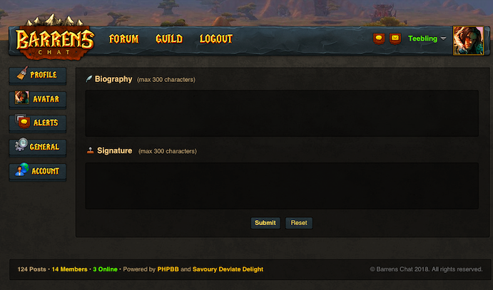
Also, normal text on top main bar, instead of images: