 images/media/bchat6.png
Patch 1.6
25th February 2019
Updates to tools and guides
I got a lot of positive feedback about the stats and comparison tools when they were released. There were however a lot of issues highlighted too - bugs and and oversights on my part mainly.
Besides this constructive criticism some people also shared more knowledge, ideas and suggestions that could be made to improve the content in question. This also applies to some of the guides I have written.
So I have taken everyone’s comments on board and made some long overdue updates to these tools and guides to improve them and bring them up to a high standard of accuracy and quality:
Classic Race/Class Comparison Tool
Base Stats Calculator
Level 19 Rogue Twink Guide + BiS
I did actually update this at one point but it was somehow lost in a database repair and honestly I don’t know why. Anyway here are the changes which I’ve remade:
Styled hover preview text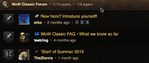 /images/updates/tooltip.gif
Formatted the hover text to parse HTML (was showing unnecessary code tags before) and also styled it look like a framed tooltip in the WoW UI :) Hope that this is useful for folks and adds more to the warcraft-y theme of the site:
Support for PHAT mobile screens
Used some javascript to detect the user’s viewport and adjust the initial render scale, so that people with massive phones will at least see an edge-to-edge site that doesn’t waste screen real estate on either side:
Before:
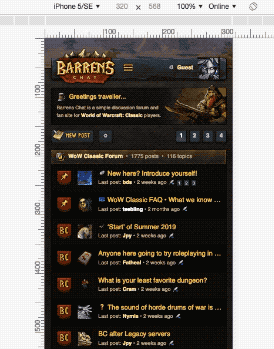 /images/updates/before.gif
After:
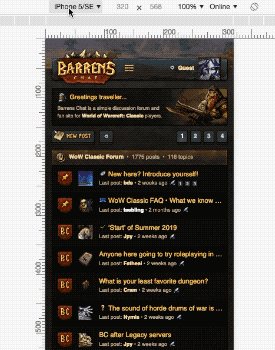 /images/updates/after.gif
I tested this on about 20 different virtual devices (not just iPhones either - Samsungs, Pixels etc. you name it). Only chose the iPhone range as a simple example which I could make into the GIFs above :smile:
Let me know if this is working correctly on your device and if it has made a difference. You should still be able to see the desktop version of the site on any phone when you orientate it to landscape.
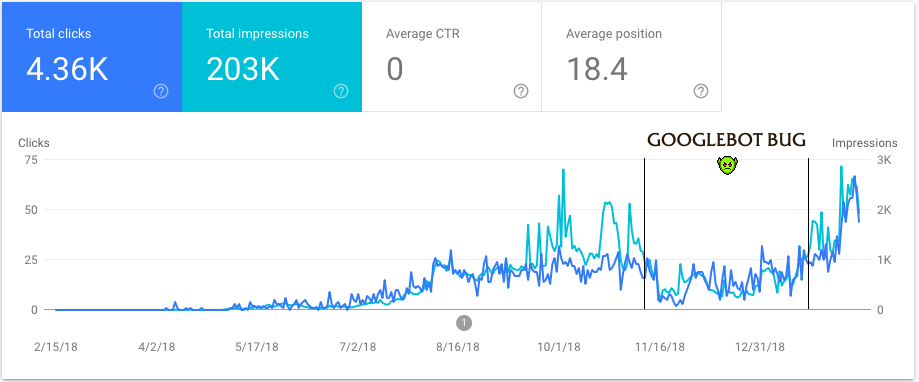
Performance insights
We’ve had a lot of new people join recently and there has been some great posting going on which makes me really happy :) For me the site is successful if people are enjoying it here and using it to talk about Classic, ‘performance data’ be damned.
That said, as an admin trying to actively grow our community stuff like this is important for me to keep an eye on in order to better understand how I can get the word out about BC. I thought you guys might also find it interesting to see some of the data too so here are some graphs for you:
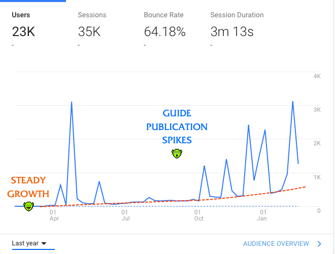 /images/updates/analytics.png
 /images/updates/searchconsole.png
Carousel discontinued
Removed the carousel feature from the site. It was very resource intensive, didn’t look right, had lots of cross platform bugs and was a bitch to update and maintain altogether. Guests will still see a welcoming banner as a static object, because it does look nice on its own and provides a simple and succinct ‘wtf is this website’ answer straight away for guests and crawl bots.
Other changes
Bug fixes
Comments
Again, not a very feature-rich update because I am still focusing heavily on content creation and publicising the site more than anything else. This patch is more of a refinement with only very small changes to make the sure the site is fast, streamlined and ready for the visitor spike on release which is not far away!
As usual, any comments or feedback just reply to this topic. If you find any new bugs do leave a report in the thread for me so I can fix them :smile:
Your boy,
Teeb

A slow, but growing userbase! I think you have come a long way with this website, since it makes me want to return and post here every now and then. It's certainly a website that has caught my attention and makes me feel at home.
Every update doesn't need to have a massive new feature. Performance and function is important too.
Will be fun to see how this website will grow and what future updates will come to it.
I wondered where the heck the carousel went >:(
I really liked it actually. The site has lost a lot of personality by removing them, they looked unique. What were the issues? I could help you fix them.
What were the issues? I could help you fix them.
There were a few issues. I would normally attempt to fix them like I do with other bugs but this was a monster of it's own:
So yeah, the technical difficulties combined with the fact that I didn't like the way it looked and didn't think it was worth all the extra regular work to keep updated were the contributing factors to discontinuing it.
Btw teebling you have a little bug with alignment of what remains of the carousel. (Using FF I don't know about other browsers.)
I think it's the span you're using to style "World of Warcraft Classic" causing the content in the second box to get pushed down.

Just add the following property to fix it:
.topicboxswoosh {
float:left;
}
Note: I didn't test this too extensively so just be sure to check it didn't mess anything up elsewhere.
Thanks for the report I’ll check it out.
A silly question in here perhaps, but is there a way to see my own post history? Been clicking around a little bit but can't actually see any link to it, only 'recent.'
A silly question in here perhaps, but is there a way to see my own post history? Been clicking around a little bit but can't actually see any link to it, only 'recent.'
This is planned for next patch which will introduce site wide search - you'll be able to search your own post history all the way back to post 1. Currently you can only see your last ten posts on your profile.
Grats on dinging 30 btw! :biggrin:
Sounds great. Will be easier to find my own quotes.
- and thank you, halfway there!
acrmojt I tested the site on various Firefox versions (OSX and Win10) but it looks fine to me.
What I've noticed is you seem to be overriding the default sans-serif font (Helvetica) as defined in the CSS with a serif font which looks like Times New Roman or something like that - is this with a FF extension or overriding user settings? - I think this is what is causing the text to spill out of bounds and make the other slide pushed down.
Could you tell me your OS/FF version and any settings regarding fonts so I can emulate the bug?
I'm using xubuntu 18 LTS. Firefox 65.0.1. I do not have any font modifying extensions or settings in my browser. I've checked my inspector and I am rendering the Helvetica font.
The good thing about floating those boxes is it will eliminate this issue on all browsers, whether or not they have the spacing overflow.
I'm using xubuntu 18 LTS. Firefox 65.0.1. I do not have any font modifying extensions or settings in my browser. I've checked my inspector and I am rendering the Helvetica font.
It isn't rendering Helvetica - this is what Helvetica looks like:
So it's probably like a default font from xubuntu or something? I don't know it's weird man.
The good thing about floating those boxes is it will eliminate this issue on all browsers, whether or not they have the spacing overflow.
It won't hurt to put a float property in so I'll do that for you next patch - I have no way of testing for xubuntu FF though so you'll have to let me know if it worked or not :biggrin: Thanks again.
I just tried the site on Safari and I realize you are right about Helvetica not rendering correctly. It seems xubuntu has the wrong font for Helvetica because in my font browser Helvetica is the serif font you see in my screenshot.
Very weird, but hehe after comparing with Safari I actually prefer a serif font for a fantasy look :P
Very weird, but hehe after comparing with Safari I actually prefer a serif font for a fantasy look :P
I actually experimented once with using WoW's default sans-serif font 'FritzQuadrata TT' on barrens.chat just to see what it looked like. It looked pretty dope but wasn't very readable at small sizes and also performs badly as a web font (no google fonts support or anything). Maybe one day!
Found this little bug: 